Corporate Rebranding
Drysdales Property approached Johnston Design in to rebrand their Moss Vale real estate agency, established 1989. The rebranding was successfully launched and I continue working with the agency, assisting with their ongoing marketing collateral.
Logo and Corporate Stationery
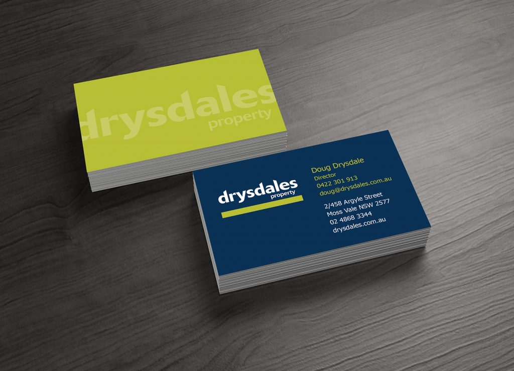
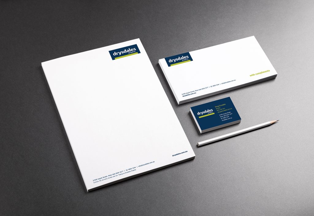
The client’s brief was to redesign the logo whilst maintaining customer recognition, along with the key messaging which was to identify the agency as established professionals, experienced, reliable and trustworthy. Given this, we decided to maintain the primary colour palette and the green line element which was modified to a simple green bar under the type. The D and L font in the logo was crafted to resemble a roofline. Logo suite includes two versions: the main block version of the logo on a dark blue background; and a second option on a white background, allowing flexibility of usage. Corporate stationery included business cards, letterheads and with compliments slips.
Corporate identity | DESIGN AND PRODUCTION | logo, letterhead and Business cards
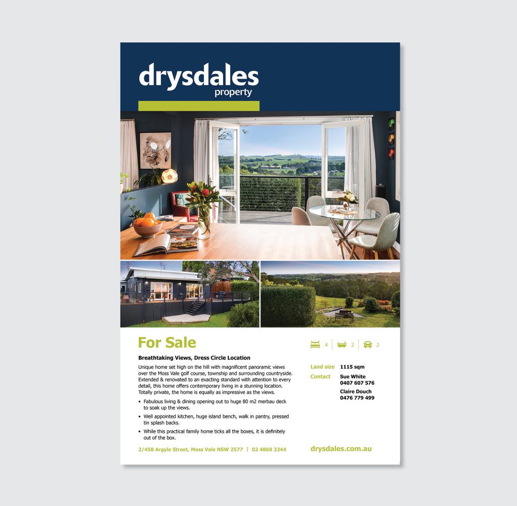
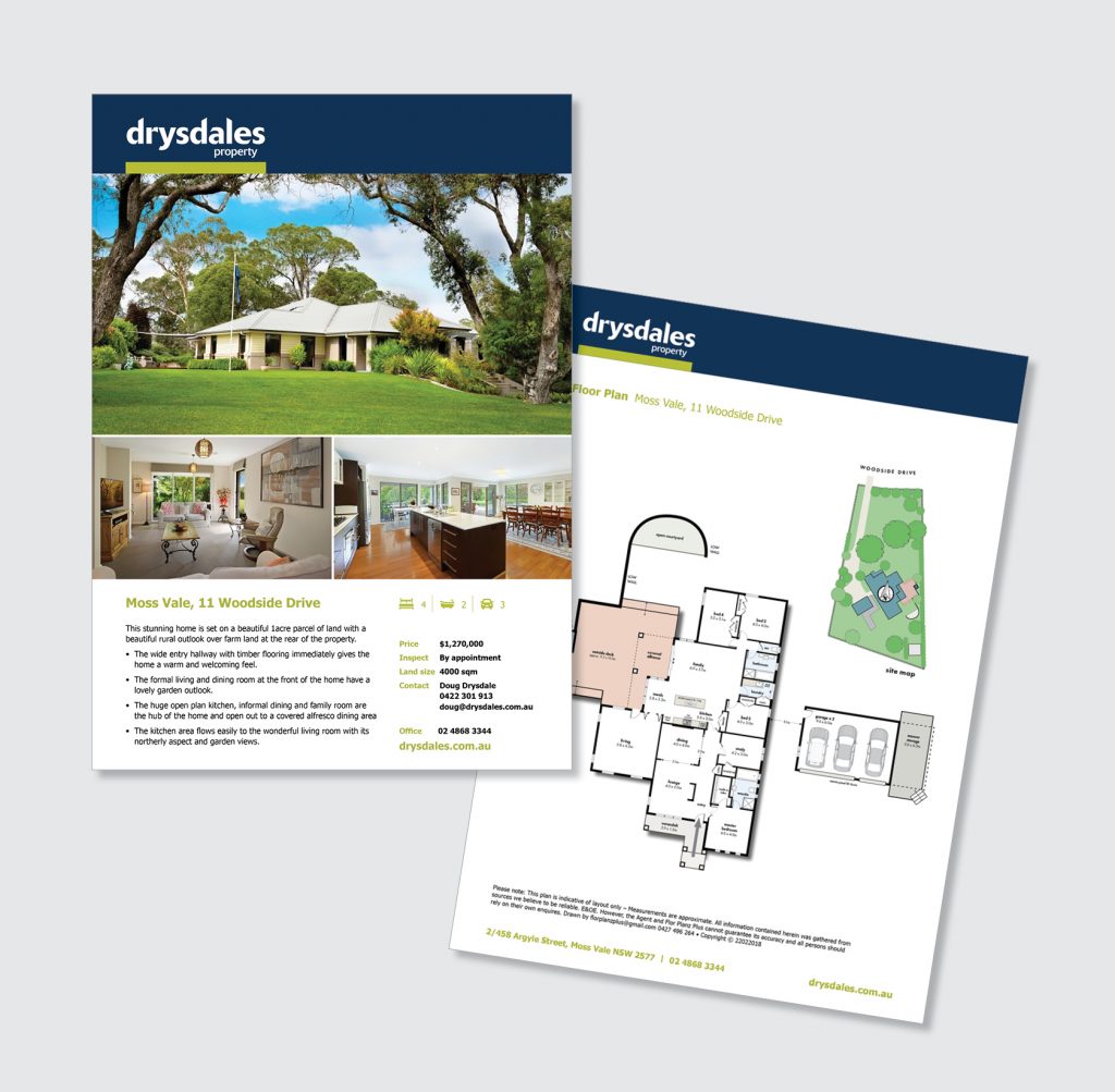
Property Sign Board and Brochure
Design sign board and property brochure that compliment each other following the rebranding brief and key messaging. Design icon set for Bed, Bath, Living, Car and Pets allowed.
Sign, brochure, icons | DESIGN AND PRODUCTION | Marketing
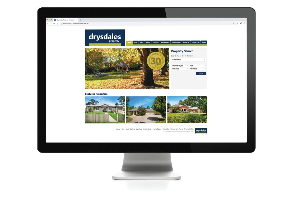
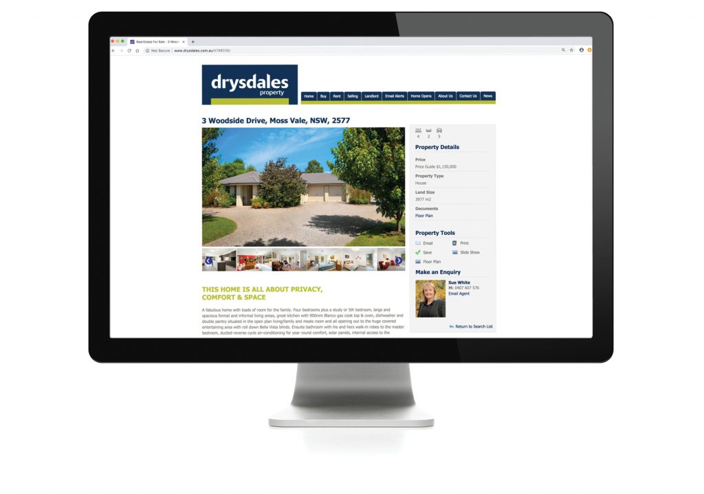
Website
Update existing website with new brand elements. These included logo, font, colours and icons. This saved them considerable cost as we could simply applied the new graphic elements to their existing WordPress site.
design, project management | Marketing
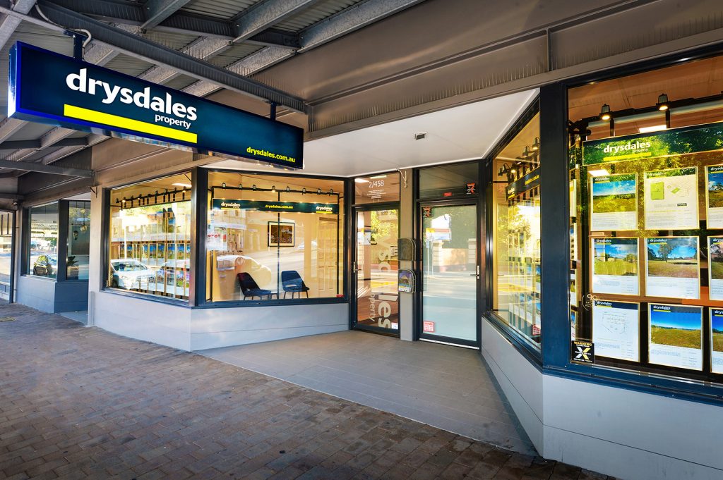
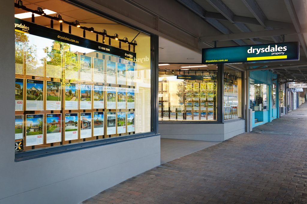
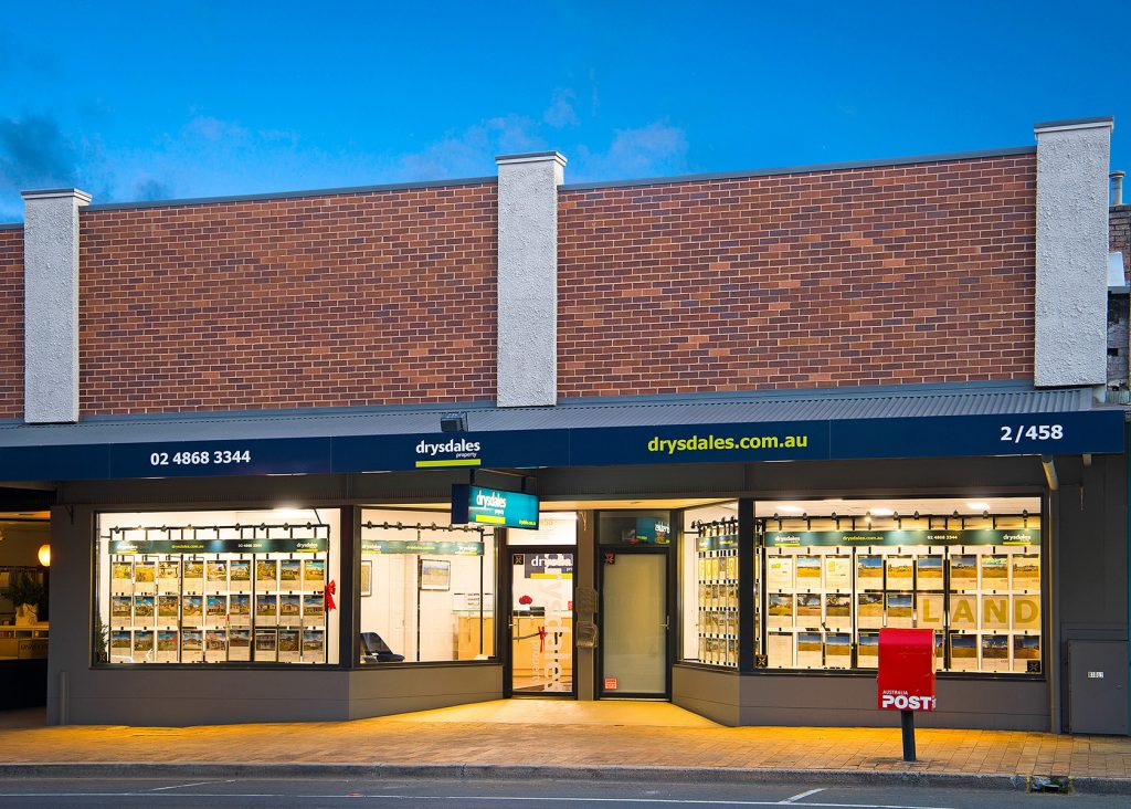
Signage
Design signage, prepare art for lightbox sign above footpath, window signage, door decal and street awning. Liaise with signage company until completion of installation.
design, project management | Marketing
