Real Estate Branding
Knight Bailey Property was established in 2013. Johnston Design worked closely with the company’s founder, Michael Cawthorn, to create the brand. I continued to produce their weekly marketing collateral and I became an integral part of their team. In June 2019 they merged with another local agent Di Jones.
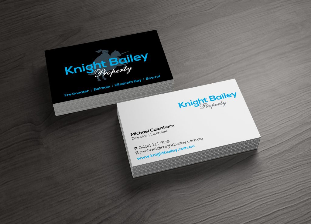
Logo
The client’s vision was to create a brand that projected a modern feel but included classic elements. Key messaging for the design was to portray the agency as professional, reliable, trustworthy, experienced, you are in safe hands. Logo suite includes two versions of the logo one with type and graphic and one that is type only, options black and white backgrounds allowing for the flexibility of usage.
Logo | DESIGN AND PRODUCTION | Logo, Letterhead and business cards
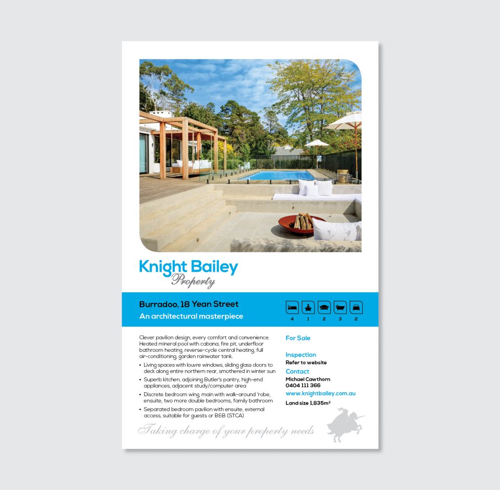
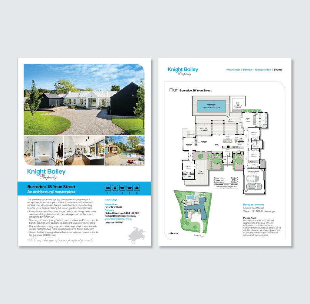
Property Sign Board and Brochure
Design sign board and property brochure that complement each other, in line with the brand key messaging. Design icon set for Bed, Study, Bath, Living, Art studio, Car, Internal area and Land size.
Sign, brochure, icons | DESIGN AND PRODUCTION | Marketing
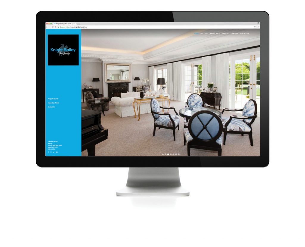
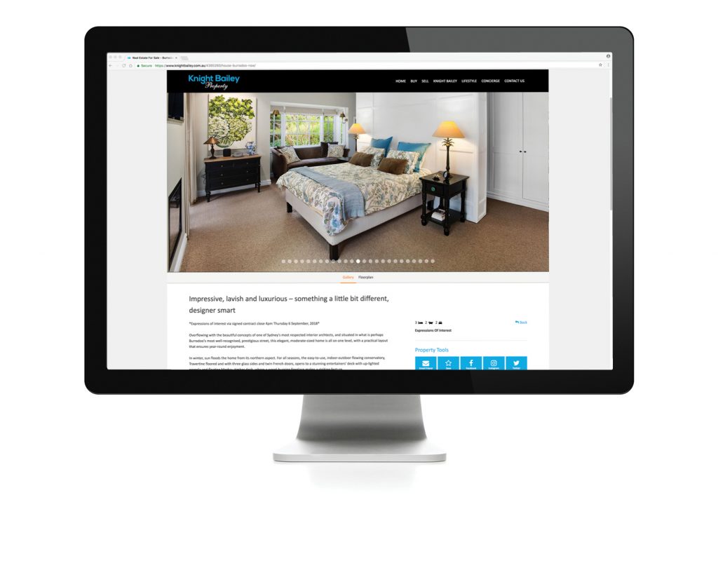
Website
Research, design and project management of website. After extensive research, we partnered with a real estate industry web development company, choosing one of their templates which we then customised by embedding our own identifying features and pages. This industry has specific requirements concerning the adding of content to their sites, using specific CRMs that feed content to the company’s website as well as to the commercial sites. The end result: ‘Knight Bailey was thrilled’ with the final design, as well as the practicality and independence that the website offered them.
website Research, design, project management | Marketing
