Logo Design

Tech-Enabled Employment Alliance

The brief was to create a logo that showed the relationship between the employees and the Alliance body that was there to assist them.

Corporate identity | Design, Illustration AND PRODUCTION | Branding

Sydney Urological Associates

The brief was to create a logo that was not overly medical, yet informative, and exhibited sensitivity for the topic. For this reason, I chose a delicate colour palette and a soft-edged font reflective of the human body.

Corporate identity | Design, Illustration AND PRODUCTION | Branding

Dr Bonnie Palmer

Logo for a private practice dealing with a sensitive and traumatic subjects. The brief was to create a design that portrayed connectivity of the brains function whilst displaying a gentleness and sensitivity to the subject. 

Corporate identity | Design, Illustration AND Production | Branding
Mariner Boating Holidays

When I started working with Mariner back in 2001, their logo was single-colour British racing green with a sail graphic and type that looked dated, and I felt the green was out of touch with the brand. The logo was updated to a two-colour logo with a colour palette that was in-line with their business of sailing holidays the only element that was maintained was the sail graphic. 

Corporate identity | Design AND PRODUCTION Business cards and Letterhead | Branding

BelleBear Foundation

I was commissioned by artist Lea Kannar-Lichtenberger to create a logo for her artist’s foundation, a subject very close to her heart. The name BelleBear represents Lea and her late husband, hence the entwining of the B graphic.

Corporate identity | Design and Production | branding

Food Regulation Partnership

Design and produce logo for the Food Regulation Partnership, commissioned by NSW Food Authority. 

Corporate identity | Design, illustration AND PRODUCTION | branding

All Buttons Great and Small

Design and produce logo suite for a button shop in King Street, Newtown, now a renowned institution, well patronised by haute couture and home sewers alike! Created in 1989, this logo has stood the test of time.

Corporate identity | Design, illustration AND PRODUCTION | branding

Shadforth Cottage Child Care

The brief was to design a logo that communicated loving care as well as a focus on early education. Given this brief, two cottages were incorporated in the logo, each representing one of these required elements.

Corporate identity | Design, Illustration AND PRODUCTION | Branding

Northern Sydney Dermatology

Design and produce logo suite for a team of dermatologists based on the Sydney’s North Shore. The brief was to design a logo mark based on their initials that looked professional and catered for the medical as well as the cosmetic services offered by the practice. The dividing line is reflective of the curve of the human body.

Corporate identity | Design AND PRODUCTION | branding

Your Path Counselling and Coaching

Design and produce logo suite for a Psychotherapist based in Auckland, New Zealand. We were asked to design a logo that reflected the name of business and the thinking behind the name ‘Your Path’. That being with the counselling and coaching provided clients can move forward with their lives, choosing their own path own with confidence which leads to growth. 

Corporate identity | Design AND PRODUCTION | branding

MTHFR Support Australia

MTHFR Support Australia is a dedicated clinic that specialises in addressing health issues associated with MTHFR genetic polymorphisms and methylation issues. I was asked to design their logo and stationery suite the brief was create a logo based on typography reflective of their specialty. An additional usage for the logo was for labelling for the MTHFR supplement range, hence, another reason for the clean and clear nature of the design.

Corporate identity | Design AND PRODUCTION | branding

Tweed Valley Occupational Therapy

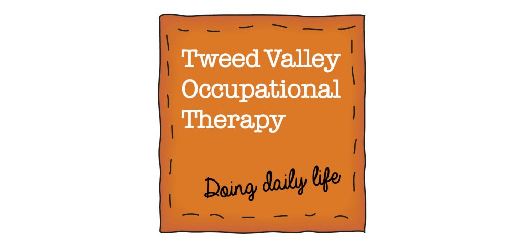
The brief was to design a logo that portrayed a warm, homely, yet professional, feel. The thinking behind this was that the majority of client appointments are held in the home, and client needs are approached by the therapist working with them in their environment, allowing the client and the family to engage in an improved daily life – hence the tag line, ‘Doing daily life’. To meet the brief, we incorporated stitching around the border and the warmth of the colour orange. The business cards and stationery also included friendly and playful illustrations representing daily life activities.

Corporate identity | Design AND PRODUCTION | branding

Ian Maloney Tax Agent

Design and produce logo suite and corporate stationery for tax agent, Ian Maloney. The brief was create logo that portrayed honesty, strength, professionalism whilst looking clean and contemporary. I chose this font for the logo mark as when the initials were placed on one another they look like pillars often seen outside of courthouses also a nod to ‘pillar of strength’.

Corporate identity | Design AND PRODUCTION | branding

Anderson Smith Accountants

Design and produce logo for Sydney based Accounting firm. Logo to reflect growth so leaf graphic used along with columns indicating financial growth for their clients. Also designed and produced stationery.

Corporate identity | Design, illustration AND PRODUCTION | branding